Get ready for the new Facebook Page layout
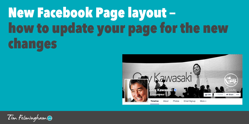
Facebook are about to change the layout of their Pages, and this will impact any business Pages or Fan Pages you have. The change was announced a while ago and Facebook said it would be rolled out over the next few weeks. Some people (such as Guy Kawasaki) have already got the new page layout but it’s not been widely seen yet. It now looks as if the rest of us are going to get it on the 6th of June but it could happen before then so it’s best to be prepared.
You’ll probably need to make a few changes to your Page to fit in with the new layout.
Here is my guide to what’s changing and what you need to do.
Changes to Facebook Cover Photo
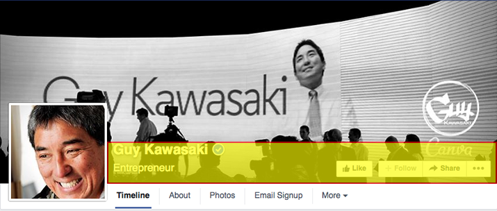
The dimensions of the Cover Photo remain unchanged at 851 x 315 pixels but some things that are currently outside the Cover Photo, such as the ‘Like’ and ‘Follow’ buttons, are being moved to inside the Cover Photo.
So the first thing you need to do to be ready for the new layout is to make sure there is nothing important in the bottom section of your Cover Photo that will be covered up in the new layout.

If your Cover Photo is just a photo then this probably won’t be a problem, but if you have made more creative use of your Cover Photo by using text, buttons and CTAs in your header (and you should do — if it’s just a pretty picture then read this article on how to make your Facebook Page work harder for you), then it will involve a bit of work moving these elements around so they fit in the new layout.
This is quite straightforward though, just keep them clear of area highlighted in yellow above – the rectangle approx 65 pixels high and to the right of the Profile picture.
If you’re not sure how to edit your Profile Photo then have a look at Canva and PicMonkey. They are both excellent free tools that will let you edit your photo and add text, banners, buttons etc. to create a Cover Photo that is more than just a picture.
If you want to find more great free tools like this, then get my Free Tools download.
Profile Picture
The Profile Picture remains unchanged at 160 px square but they still recommend you upload an image 180 px square, presumably to allow for possible changes in the future. Make sure your Profile Pic looks good at both sizes.
Custom Tabs
Instead of Custom Tabs appearing as rectangular buttons below the Cover Photo like this:
They will now appear as a navigation bar like you can see in the under the Cover Photo in the first example. Again you can select one tab to be featured in the navigation bar, and the others are accessed via the ‘More’ dropdown.
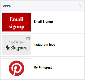
Tab Thumbnails remain the same size (111 x 74 pixels) but they now appear in the sidebar in the ‘Apps’ section instead of under the Cover Photo:
Custom Tab pages used to be very bare with just a simple header bar and a ‘Like’ button at the top. The rest of the page was yours to do with as you wished. Because the page was so sparse, many people put some sort of header at the top of the page with their branding in it.
In the new layout the whole Facebook header, including the Cover Photo, will now be at the top of all your tab pages. This means any branding in the content of your Tab pages may now be redundant or duplicated.
Also the header will push all of your copy down the page so make sure the important stuff is still above the fold in the new layout.
Post Images
Post Images are about to get bigger — up from 377 pixels wide to 484 pixels wide.
This doesn’t create any problems that I can see, it just means your images will be bigger which is a good thing. You just need to create your post images at the bigger size.
Summary
So nothing too horrendous to worry about with the new page layout, the main issue for most people will be re-jigging the Cover Photo. If you’ve made good use of your Cover Photo (and you should have done — if you haven’t then read this article!) then this change will probably be quite significant so you’ll need to get on it right away.
Custom Tabs (if you use them) will also need some changes, but the continuity of branding and appearance with the main page is probably a welcome addition. It’s going to make it easier to make good looking pages that are consistent with the main page.
If you have any questions or comments, please post them in the comments below.
Good luck with the changes and I hope you enjoy your new page!


