WordPress Landing Pages
Do you need to build custom WordPress Landing Pages quickly and easily, with complete control over their content and appearance?
Are your marketing campaigns sending Ad Traffic to your Home Page or to a general page on your site, instead of to a dedicated Landing Page?
If so, you are leaving money on the table…
In this article you’ll learn why you need dedicated Landing Pages, and how to make them very quickly and easily, using an inexpensive WordPress Plugin called Thrive Architect.
RAPID Landing Page creation is akin to Agile Development and MVP (Minimum Viable Product) — it’s about getting something up very quickly, with the minimum time and effort, and then improving it later.
What is a Landing Page (and why do you need one)?
When you run any sort of marketing or advertising campaign, you usually have some outcome that you desire — for example a sale, an enquiry, or maybe a mailing list signup, or download.
Obviously you want to maximise the number of successful outcomes (or conversions) from your campaign. That’s the point!
Typically, you will have spent money on advertising (perhaps with Google Ads or Facebook Advertising), or driven traffic through Social Media, or Email, to a page on your website where that conversion happens — the page where they buy, or enquire, or sign-up, for whatever you are promoting.
That page can make or break your campaign.
A poorly-performing page can lose all those potential customers that you’ve taken so much trouble to find. It can let them out of the back door as quickly as you’re bringing them in the front door.
A good-performing page on the other hand, one that is optimised for conversions, will boost your results significantly, maybe even hugely.
It’s not uncommon for a good page to perform two or three times better, than a less good one, or maybe ten or a hundred times better than a bad one.
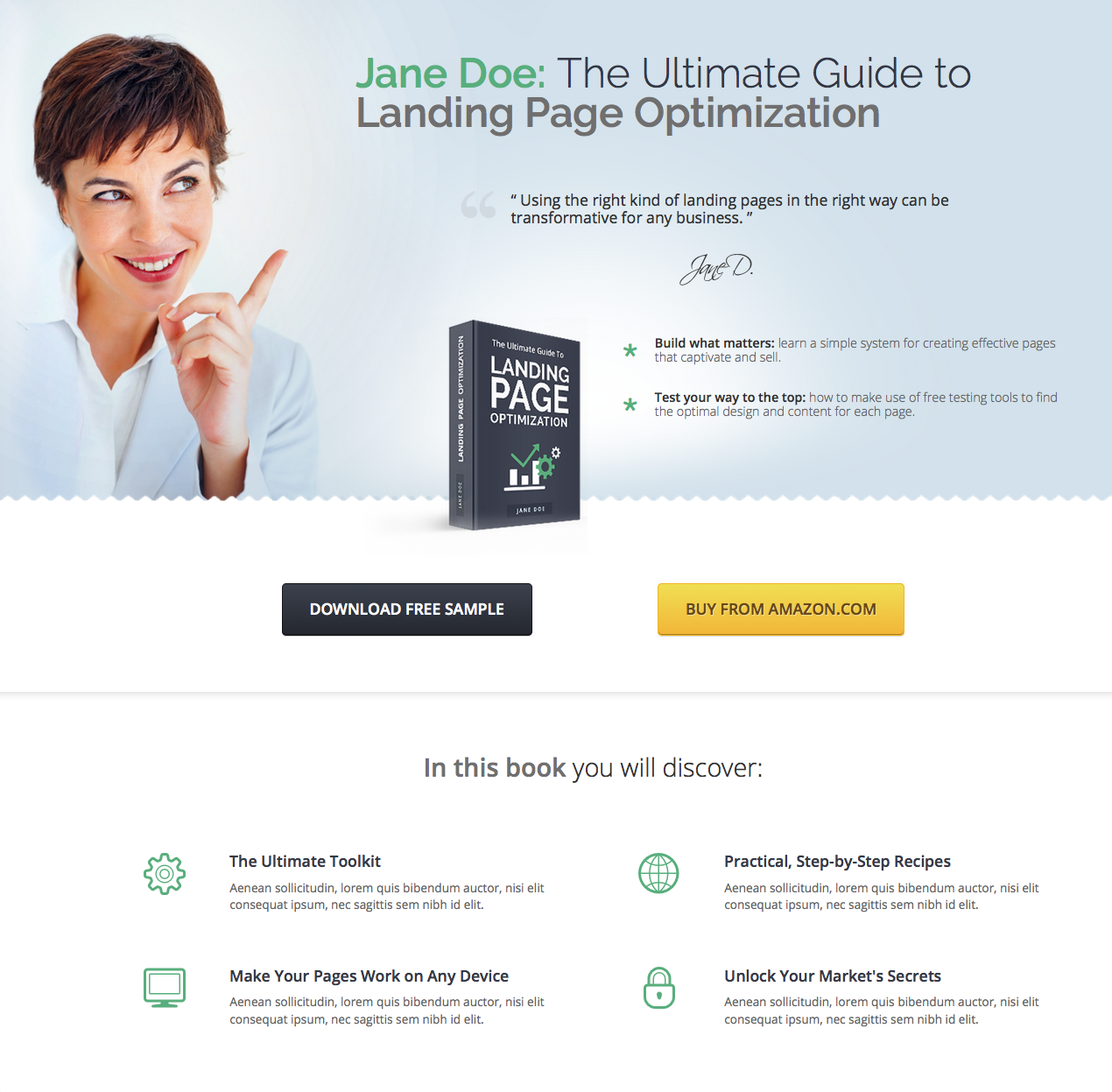
A Landing Page is a specialist page that is designed and optimised for one purpose only — obtaining that conversion. Nothing else.
Unlike a normal website page, it will usually have no navigation, no additional content, no distractions of any kind to divert the viewer from performing the desired action.
There should be nothing on the page that gets in the way of the viewer doing what you want, whether that is to buy something, or signup, or whatever your goal is.
To get the maximum results from any marketing activity, you should send people to a dedicated landing page for that particular goal, rather than just sending them to a general page on your website (or even worse, the Home Page).
An effective, conversion-optimised Landing Page, will give you the maximum bang for your marketing buck, and can be the difference between success and failure.
Create Landing Pages RAPIDLY
Landing Pages are really all about optimisation — achieving the best possible results, the best conversion rate.There is a natural human tendency to agonise over the details:
“Is this headline better than that one?”
“Can we write some better copy?”
“Which picture works best?”
“Shall we make it red or green?”
You can spend hours, or even days or weeks, fine-tuning your landing page, before you launch it to the world.
But as Shane Melaugh, the founder of Thrive Themes, points out:
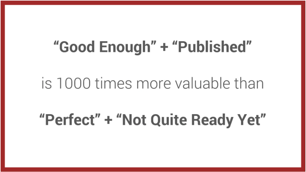
The important thing is to get your landing page up. You can improve it later.
That’s what RAPID means: Make a landing page quickly, get it deployed straight away, then test and optimise it later.
With Thrive Architect, you can easily build a simple landing page in under an hour, and have it working for you, whilst you ponder on improvements and alternatives.
And actually, however long we spend thinking about it, and debating, we will never know if ‘this headline works better than that one’, or if ‘green is better than red’, without trying it.
The only thing we can do is to test it. With real customers (because you are never your own target audience, and they won’t act the way you do).
So make your first landing page and get it up and working.
Then try some variations, and see which one performs best (and it’s often not the one you expected it to be).
That’s the only way to know. And that’s how you optimise to get the most conversions.
We’re now going to look at how to create landing pages with Thrive, and we’re going to look at two different types of landing page.
Firstly, we’re going to create a simple lead-generation page, designed just to capture email addresses, and then we’re going to look at creating a long-form sales page, designed to sell something.
How to make a Lead Generation Landing Page
Thrive Landing Pages comes with a number of proven ready-made templates, that you can modify to suit your needs. If there is something there that is close to what you want, then that can be a very quick way to build your page.
But one of the things I like about Thrive (unlike LeadPages), is that you can start from scratch with a blank sheet, and design exactly what you want, rather than having to adapt a pre-made design.
So we’ll start from scratch (and it’s still pretty quick).
With the Thrive Architect plugin installed, just create a new page, name it, save it as a draft and then click the ‘Edit with Thrive Architect’ button.
From the Thrive Architect drop-down, select ‘Choose Template’ and select the ‘Blank Page’ template.
You’ll then see a page like this, with some default content to get you started — a logo, a heading, and some links for a privacy policy and disclaimer (some advertising platforms such as Google and Facebook require this). Just delete them for now.
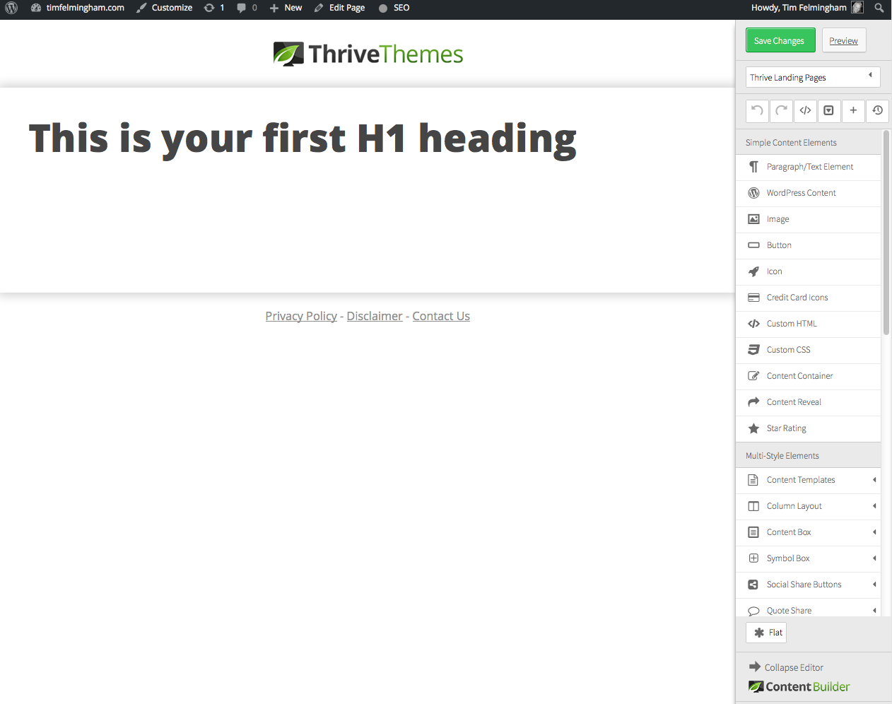
The menu on the right-hand side has a number of elements that you can just click and drag onto the appropriate part of the page.
Each element has it’s own properties that you can set, such as font, size, paddings, colours, etc.
As well as text and images, you can add multi column layouts, buttons, opt-in forms, credit card symbols, and many more goodies.
Drag a content box from the menu on the right onto your page. This is just a container that will hold all the elements of the page.
Because we’re very goal-focused, we’re going to start at the end! This is a lead generation page, so the first thing we’ll add, is the outcome we want — an email signup.
From the menu on the right, drag a ‘Lead Generation’ element onto your page, inside the content box you just created.
You’ll see it has various properties you can change, to make the fields and button appear how you want, and you can link it to your email service too, so that signups are added directly to your mailing list.
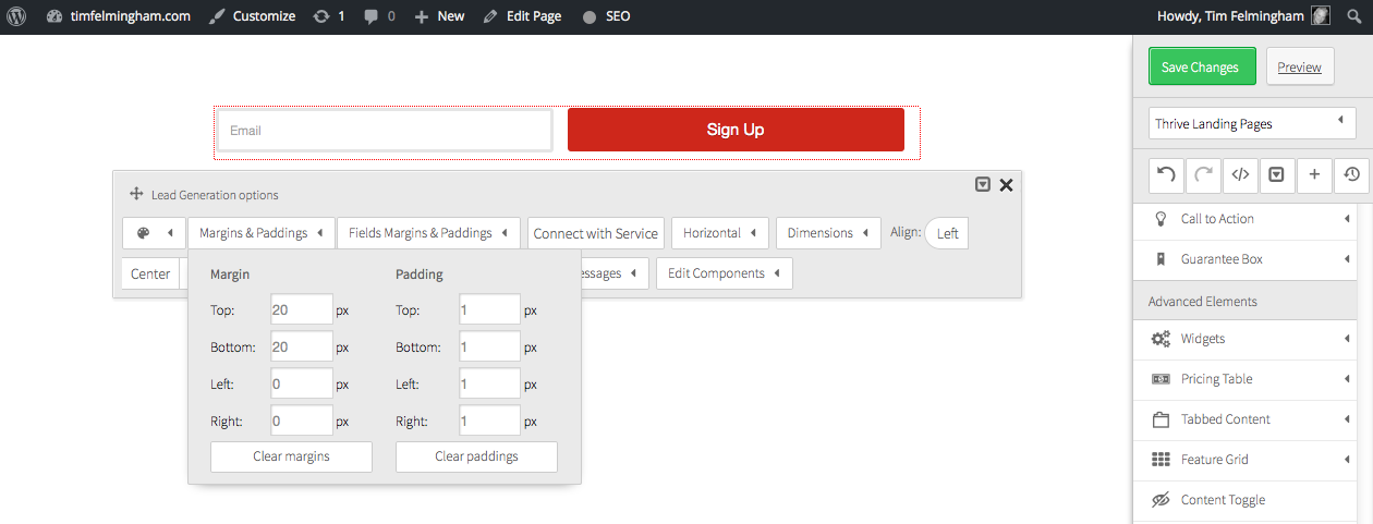
Next, we’ll add a headline, and some body copy, again by simply dragging the elements from the menu on the right.
Underneath that, we’ll add a two-column content layout with some bullet points on the left, and an image on the right.
And so we have a rudimentary layout of a landing page, which took about 5 minutes to create:
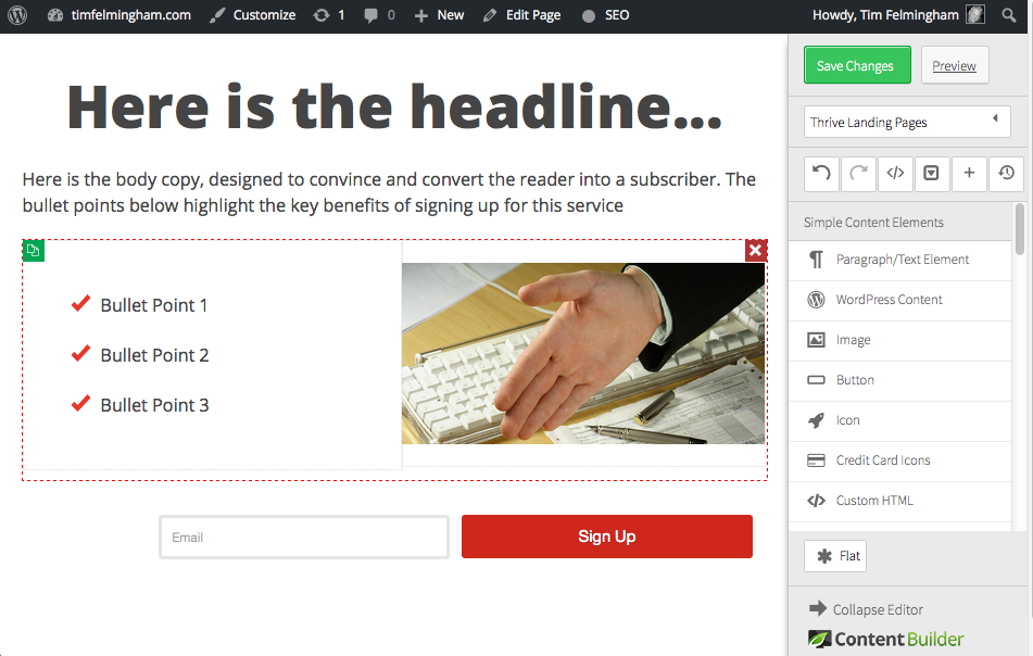
With a few tweaks, by simply dragging and dropping the elements you require, and altering their settings and contents you can soon make this into a very smart and professional landing page, with no coding or HTML skills at all!
Like this one for example:
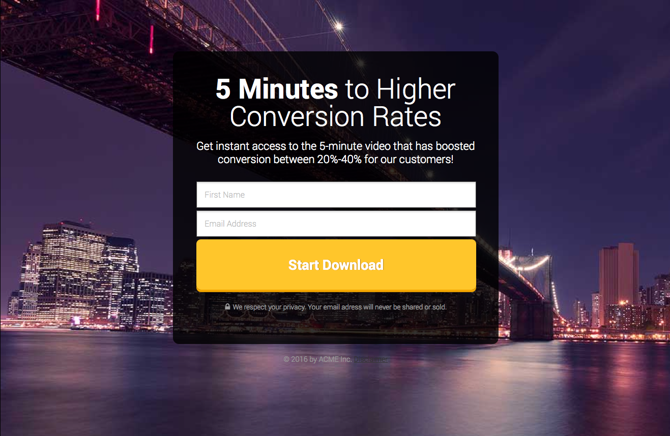
Or this one:
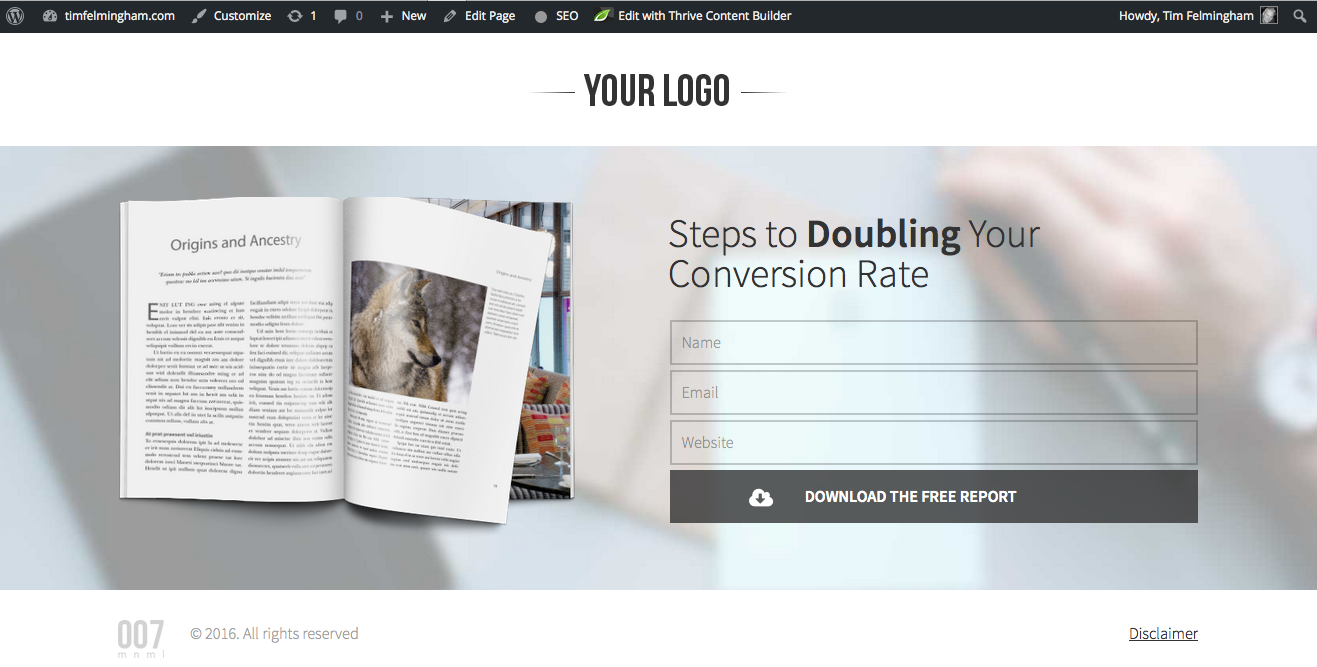
Both of these pages are from templates included with Thrive, so if you like them, they are already created for you. Just change the copy, add your own pictures and logo and you’re good to go.
So those are simple Lead Generation landing pages that link to your email service, but what about more complex pages? Long-form sales pages for example, with many elements, including video and more complex designs?
How to make a long-form sales page with Thrive Architect
Long-form landing pages are created in exactly the same way. There are just more elements on the page, so you simply keep on adding them, in just the same way as for the short lead gen page.
Here are some of the elements you can add to a long-form or hybrid sales page:
- Buttons & Calls to Action
- Testimonials
- Feature Grids
- Multi-column layouts
- Countdown Timer
- Responsive Videos
- Table of Contents
- Content Reveals
- Styled Lists
- Guarantee Forms
- Tabs & Toggles
- Lead Generation Element
- Responsive Google Maps
- Tables
- Star Ratings
There is a lot of debate about long-form landing pages — are they good or bad?
They take a very long time to write and produce (because they are looong).
They look very “salesy”, which some people find off-putting.
So why do people use them?
Simple — because they WORK (if they are done well).
Different things work in different markets, but by and large, long-form sales pages will usually convert better than short ones. Particularly if it’s for a high-ticket, or complex item.
One of the great things about Internet Marketing is the ability to test things. You can try different sales pages (long v short, different headlines, different offers, different calls to action etc.) and see which works best. Then you are making decisions based on data rather than guesswork.
So don’t be put off by long-form sales pages, there is a reason why everybody uses them, so you should at least try them.
But remember we’re talking about RAPID landing page development, so follow the key principle of getting something up NOW, and refining it later. A page that’s not up yet, doesn’t convert at all!
Further reading on Landing Pages
Landing page experts Unbounce have an interesting article on when do you need a long-form sales page that discusses the best applications for long pages.
There’s a great infographic by Joanna Wiebe on how to create long-form sales pages which will give you plenty of ideas, and some tips and best practices you should adopt.
Neil Patel has just produced a very in depth article covering the 6 types of Landing page that convert the best.
This post contains some affiliate links. Read my full disclosure.
